We spend a lot of time browsing websites and a lot of day-to-day routines are tied to the internet, whether it’s online shopping, signing up for bills or talking to friends and family. In spending so much time online we’ve discovered that there are many, many, MANY things that frustrate us about websites. And the worst thing is, in many of these cases companies KNOW that they are frustrating customers and, guess what? They are doing it on purpose, by employing tactics called dark patterns.
Dark patterns are user interfaces that are designed to trick users into doing things, such as signing up for recurring bills or being forced into receiving marketing material. Dark patterns aren’t designs that were poorly done by mistake – they are intentionally created for a business’ own gain. As a customer, I hate them and as web designers, dark patterns are not tactics we at dodify would ever advise doing.
There are high chances you have fallen victim to a dark pattern and likely didn’t even realise. Darkpatterns.org is a great website that contains a library of examples and gives a comprehensive breakdown of all the various types of dark patterns. Take a look, do any of them look familiar to you?
Here are some examples we often experience:
The dark pattern: Forced Continuity
This is when a user is required to enter credit card details in order to sign up for a free trial on a website. When the trial comes to an end, they automatically start getting billed for the paid service. This tactic is so commonplace that people now think it’s normal and accept it as a regular sales tactic.
Why it’s dark
Companies often don’t give reminders that the trial period is about to end and rely on humans to naturally think (i.e. most people will forget to cancel and will pay a couple of months’ worth of fees before noticing any charges). OR they will make it difficult to cancel the renewal, such as by hiding any kind of cancel function or forcing users to call in to speak to an agent.
How to make it honest
Give users an adequate reminder when their trial period is about to end and/or make the trial account easy to cancel. Customers appreciate transparency and the opportunity to make their own decision rather than have decisions imposed on them. You may have good financial return in the short-term, when customers do not realise they are being charged, but what kind of impression will they have on you as a company when they realise they’re paying something they didn’t know about? It won’t be a good one.
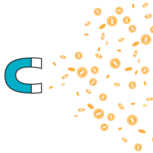
The dark pattern: Roach Motel
Roach Motels are situations where companies make it very easy to sign up for something and extremely difficult to leave. Reasons companies may implement this is to reduce churn and keep key figures high (e.g. you may have 10k email subscribers but how many of these subscribers actually want to receive content from you?).
Why it’s dark
These companies are basically trapping you into staying with them for as long as possible, by making it extremely difficult to cancel or deactivate an account. Skype is a prime example of a Roach Motel. Have you ever tried to end your account with them? It’s impossible. The only way to do so is to contact Skype Customer Service and according to the community forum, it will then take up to 2 weeks to remove your name from the directory. But even after that, you will still appear in people’s contact list unless they decide to remove you.
How to make it honest
Allow users to cancel and unsubscribe easily. If signing up for a service was as easy as checking a box then cancelling should be just as easy. If that’s not possible then allow me to remind you of the power of transparency. If unsubscribing really isn’t a simple process, then let users know before they sign up what the cancellation process will be like.
The dark pattern: Hidden Costs
Hidden costs are when surprise fees pop up at the last step of the checkout process e.g. delivery charges, service charges etc.
Why it’s dark
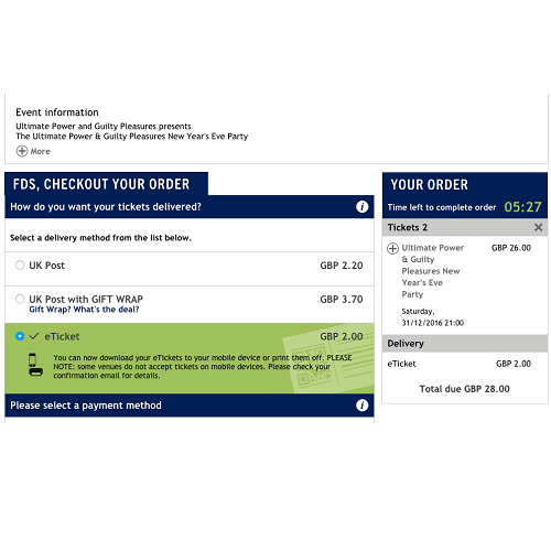
Is there anyone who enjoys paying unexpected fees? Take a look at this example - has this happened to you?
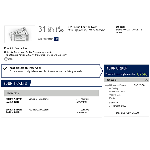
1. See ticket prices - everything looks fine.
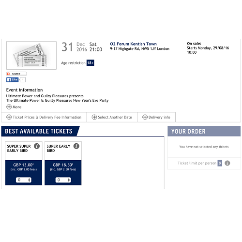
2. Proceed to add 2 tickets to the shopping basket. Everything still looks fine.
3. Arrive at the final page and what is there? Delivery charges all of a sudden pop up. Even for an e-ticket!
How to make it honest
As is the case for making many dark patterns honest, it’s all about transparency and letting users know what to expect. Let customers know in advance that there are extra associated costs so there are no (bad) surprises.
So, to end off, there are ethical ways of getting people to continue to be your customers and there are deceitful ways of retaining customers and/or having them spend more money with you. At dodify we try our best to employ ‘honest’ tactics when designing websites. Interested in seeing more? Take a look at our portfolio!
Share this article