Year
2021
Client
Spesati.it
Projects
Brand - Logo
Online
spesati.com


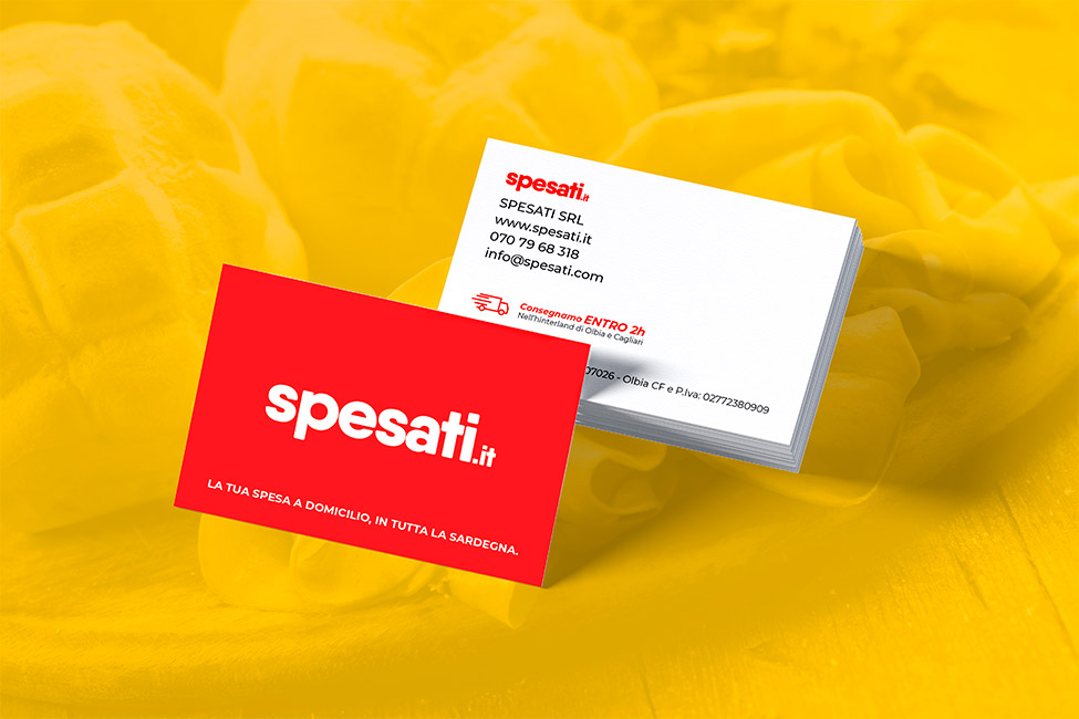
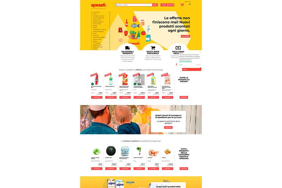
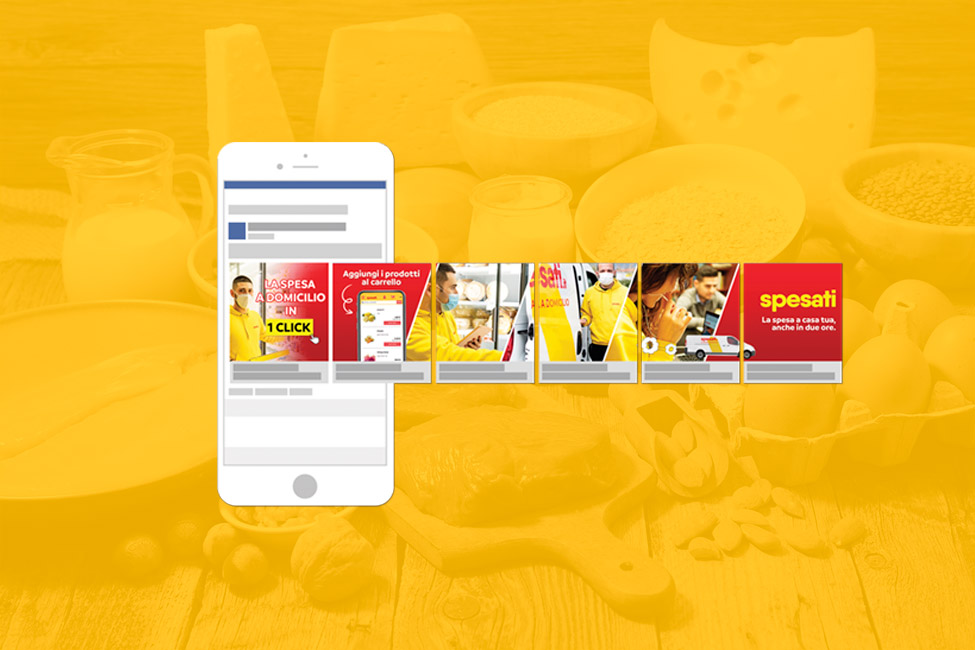
The revamping of the Spesati brand, an important player in the world of online grocery shopping with home delivery, consists of a work of simplification that involves eliminating the initial pictogram in favour of the current and modern logo: preserving and enhancing the typographic component with bursting chromatic contrasts and simple but distinctive background elements, the intention is to maintain a link with the visual identity that has matured over time and has been imprinted in the client's imagination, in a perspective that tends to “streamline” rather than revolutionize. Because, as someone said, “less is more”!
