Websites – we all use them and it’s a must-have no matter what kind of business you’re in. Because websites are used by the majority it’s thus important to design them in a manner where the vast majority can use them. That being said, let’s introduce you to this blog post’s feature topic: Accessibility.
Bath Digital Festival’s Web Day offered both techies and non-techies to explore topics related to the modern web. As web designers and web developers, the ‘Accessibility By Design’ talk, presented by Laura Balkan of ind.ie, particularly struck our interest.
The point of the talk was to demonstrate that although the web is freely available to people all over the world, websites aren’t always designed to make it accessible for everyone.
What does it mean to have an accessible website? Web accessibility refers to the practice of removing barriers that prevent website access by people with disabilities. There are four main types of disabilities web designers should be aware of when designing functional websites that can be used by all:
- Visual (eg. Blind, colour blind, poor vision);
- Hearing;
- Motor (eg. Slow response, unable to use a mouse etc.);
- Cognitive (eg. Learning disability, easily distracted).
The key to creating an accessible website is fairly simple. It’s about empathy. Empathy will lead to a good product because it shows you know what people need, and you can place yourself in their shoes and think from a different perspective.
Laura spoke about having usability goals:
- Make websites easy to read;
- Make websites easy to hear;
- Make websites easy to interact with;
- Make websites easy to understand and easy to focus on.
Although we have our own web design process it was extremely valuable to hear tricks of the trade and to learn what tools fellow web designers use to create effective websites.
For example, how colours are used is extremely important for an effective website. We know about complementary colours and the need for high contrast colours. We learned about available tools to ensure the colours we choose are suitable for users. Even if you’re not a web designer you might find these tools very interesting!
Contrast Ratio
The Contrast Ratio tool works by letting you input a background colour and a text colour and comes back with a score of how readable your colour combination is. You can either type in the colours you wish to use or if you know the hex colour code you can insert that as well.
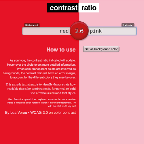
Low score of 2.6 – no good!
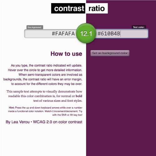
High score of 12.1 – much better!
Color Oracle
The Color Oracle is a more sophisticated tool; it’s a colour blindness simulator that allows you to view how your website will look like to those with common colour vision impairments.
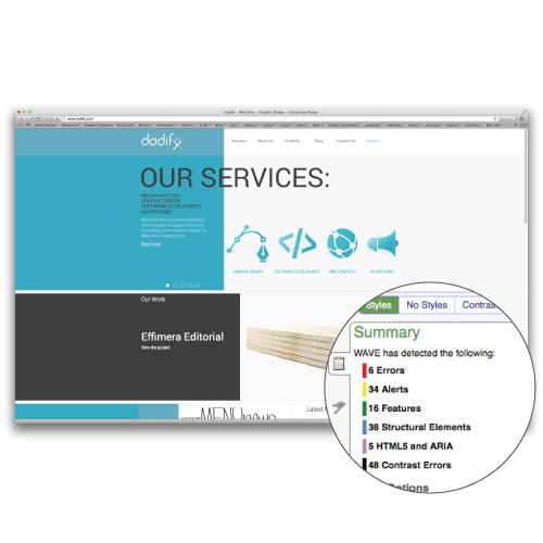
WAVE
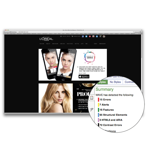
WAVE (Web Accessibility Evaluation Tool) was probably our favourite discovery. WAVE is a web accessibility evaluation tool that provides real time feedback of how accessible your website is. Just insert whatever website you want to evaluate and WAVE will evaluate the website and notify you via icons and indicators what needs to be improved.
We decided to test the dodify website and while the results weren’t horrible we learned that there are a few things we should fix up to make our website accessible to all.
But compared to a big name brand like l’Oreal we did pretty well!
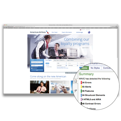
And American Airlines:
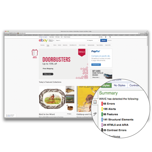
Or eBay:
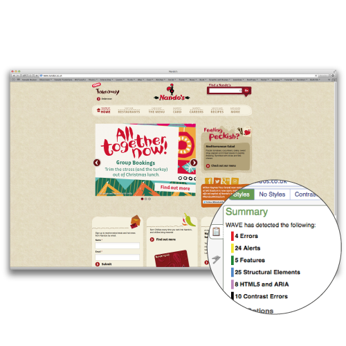
What we’re striving for are to get our levels up to something like good ‘ol Nandos!
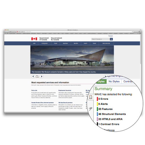
Or impressive www.canada.ca with zero errors!
To recap, in this day and age it is vital that a business’ website is easy for everyone to use, no matter what kind of handicap one may have. There are ways of overcoming many barriers to make one’s website accessible for all. For example:
- Making your text large enough to be read – who wants to squint at size 8 font?
- If you have videos, provide subtitles for those that have a hearing disability;
- Keep your web animations to a minimum to avoid your users getting distracted and/or confused by all the activity that’s going on.
Here some food for thought: When Virgin decided to majorly invest on making their website more accessible their sales increased by 68% in one year. Imagine what an accessible website could do for YOUR business!
Share this article